Amazon Subscribe and Save
Mobile app design for budget tracking and spending transparency
Project Type: Concept
Duration: 2 weeks, September 2021
Role: UX/UI Designer
Platform: iOS HIG Mobile
Tools: Sketch, InVision, Whimsical
Subscribe and Save
Subscribe and Save is a membership feature within Amazon that allows users to set up recurring monthly deliveries for common household items. Each item can be set up for delivery on the same date each month. Subscribe and Save also allows users to modify how often they would like shipments of each item and at which quantity.
Challenge
The current design of the website for Amazon Subscribe and Save makes it difficult for the user to know what their anticipated monthly and annual spending will be. The current UI excludes the cost of each item and what the anticipated spending for the months delivery will be. The opportunity in this project was in being able to set up a budgeting interface to set monthly spending limits and track monthly spending. Through user research, we found many more areas of Subscribe and Save that could use a makeover in addition to expense tracking.
Current Amazon Subscribe and Save Website
While on the main page for Subscribe and Save purchases, all of the recommended items are not designated for Subscribe and Save. If you click on one of these items, you will be automatically taken out of the membership section.
My Role
As a UX Designer on this project, I was responsible for:
Competitive analysis and user interviews to identify pain points in the current Subscribe and Save experience
User persona development and journey mapping to understand member needs and behaviors
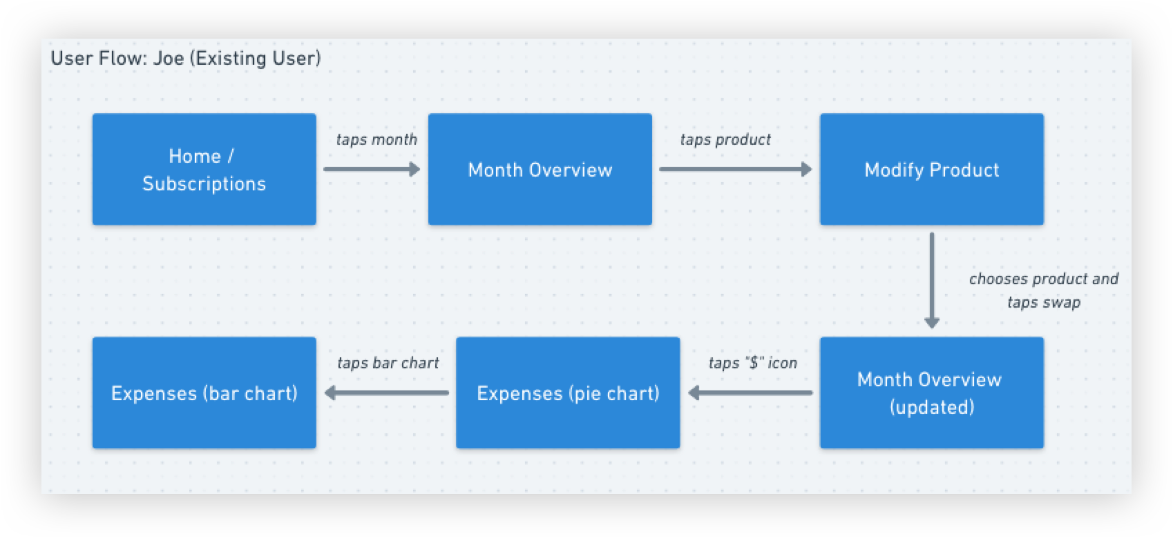
Facilitating design studio sessions and creating user flows for key personas
Wireframing and prototyping iOS/HIG-compliant mobile app interface using Sketch and InVision
Conducting usability testing at Home Advisors design lab and iterating based on feedback
Developing problem/solution statements and presenting findings to stakeholders
Research
Curious about the experience and expectations of current Subscribe and Save users, we entered the discovery phase where we tested the existing Subscribe and Save site by user testing. Our goal was to understand the challenges members faced and how they navigated the website. From user testing, we were able to observe 4 main pain points to the current Subscribe and Save feature of Amazon’s website:
Inconsistent Product Listings
Not all items listed on the subscribe and save section of the website can be added to a monthly membership.
Price Irregularities
The price would change on an items and the subscription holder was not notified.
Lack of Spending Transparency
There is no way to track monthly spending or anticipate their future months spending.
No Set Spending Guidelines
Spending in the Subscribe and Save membership could easily go over one’s budget due as there was no way to set spending limits.
Card Sorting and User Interviews:
The from the same group, we conducted user interviews and card sorting. It was through this process that we were able to determine what the user was interested in Amazon providing specifically for Subscribe and Save members:
Findings
A mobile iOS/HIG app would allow Subscribe and Save users to access their account from an insulated platform. From this platform, the user would be able to modify their order, check their spending, be notified on price changes, and shop only subscribe and save designated items. Currently this option is not available to Subscribe and Save members.
Users
Based on the research found in the discovery period of the project, two personas were developed, Genevieve and Joe. Designing for these two personas helped in making informed design decisions as we had the end user always in mind.
Jeremy
“Time is money and money is time. My family holds the most importance in my life, so having time to be with them is the most important thing.”
50 years old, Tech Professional
Genevieve
“I’m a busy student. I want a way to track my online shopping so I can see where my money is going and not overspend.“
29 years old, Graduate Student
Design
By creating a user friendly iOS/HIG mobile app, the Subscribe and Save member would have access to their personal account. While on the app, they would only have the option to subscribe to items that are designated for subscribe and save.
To bring our first ideas into form, we ran a design studio where we were able to knock out some early ideas on how to organize a mobile app that captured the needs of convenient shopping, price transparency, and expense tracking.
User Flows
One of the first steps in the design process was in creating the user flows for Jane and Joe. This allows our team to further understand these two personas: what they would need from the app, how to navigate the app, and common steps a user would take in using the app.
Wireframes
After a design lab and user flows, wee then began designing the wireframes based in Apple’s Human Interface Guidelines.
Here we began to explore the importance of the footer icons, product pages, and item indicator to receive a 15% discount once 5 items were added to a monthly purchase.
Prototype
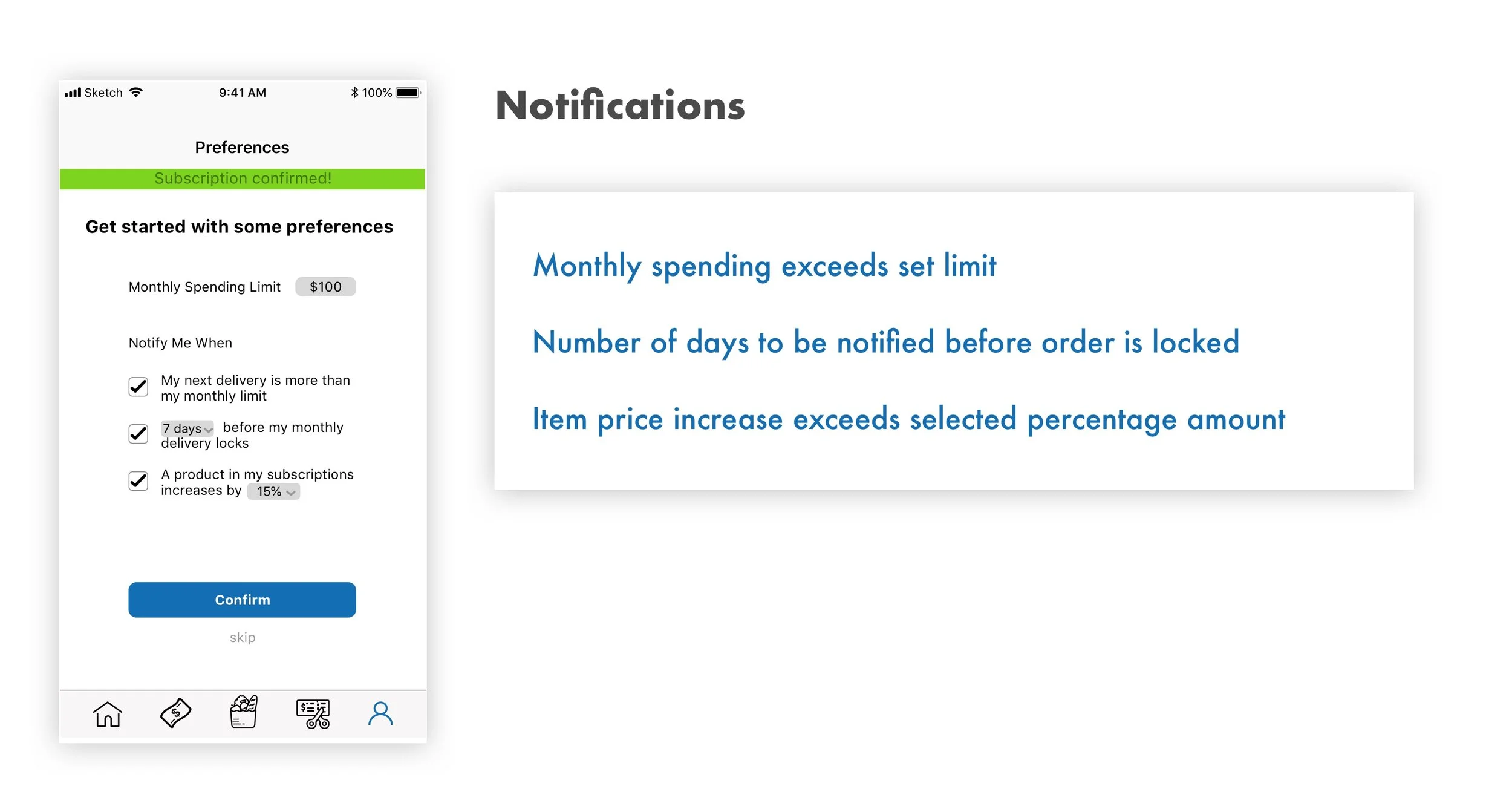
With the initial wireframes we really began to tackle the problems of how to track spending, set a monthly budget, receive notifications on on price changes, and show more transparency with product prices in ones monthly purchase bundle.
By adding a onboarding preferences page, users can easily set their notifications and budget limits
An expenses page is available by icon in the footer, allowing for easy access
Updating the product page, the user will always have quick access to product aspects, prices and an easy availability to change their order as needed
User Testing and Take Aways
I tested the wireframes at the design lab at Home Advisors in Golden, CO. We went through two user flows for the personas of Jeff and Genevieve.
The blue strip showing the progress towards a 5 item purchase leading to a 15% discount is confusing and should be removed
The preferences page, where the user can choose their monthly budget and notifications should be added to an earlier part of the onboarding process
The basic user flows seem to go well and the icons offer good direction
Overall, the current app meets the users need for a common Subscribe and Save member


